The Ultimate Toolbox for creating
amazing web sites!
Borders
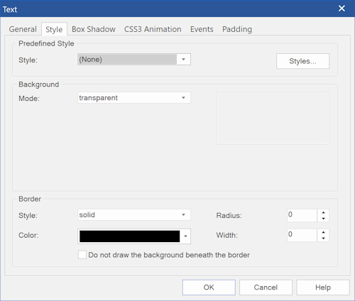
The border properties allow you to specify the style, width, and color of an object's border.
For most object's the border style can be configured in the 'Style' properties. The available options may be different per object.
For example, not all objects do support custom borders or border images.
The border properties allow you to specify the style, width, and color of an object's border.
For most object's the border style can be configured in the 'Style' properties. The available options may be different per object.
For example, not all objects do support custom borders or border images.
Border Color
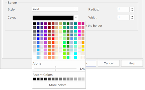
Specifies the color of the border. It is also possible to set the alpha value of the color (opacity).
Specifies the color of the border. It is also possible to set the alpha value of the color (opacity).
Border Width
Specifies the width of the border (in pixels).
Border Radius
The border radius property is used to add rounded borders to an object.
Specifies the width of the border (in pixels).
Border Radius
The border radius property is used to add rounded borders to an object.
Border Style
The border style property specifies what kind of border to display.
The following values are available:
• none - display no border.
• dotted - display a dotted border.
• dashed - display a dashed border.
• solid - display a solid border.
• double - display a double border.
• groove - display a 3D grooved border. The effect depends on the border color value.
• ridge - display a 3D ridged border. The effect depends on the border color value.
• inset - display a 3D inset border. The effect depends on the border color value.
• outset - display a 3D outset border. The effect depends on the border color value.
• custom - specify a different border for each side.
• image - use an image as border.
• gradient - use a two-color gradient effect
• multi-color gradient - use a multi-color gradient effect
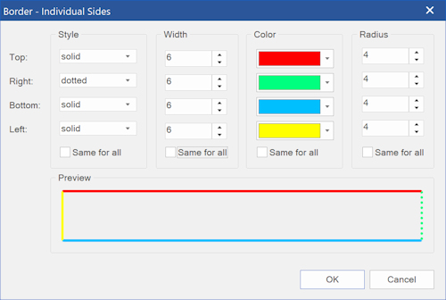
For many objects you can also set the individual style, width, color and radius for each side for the border.
Select 'custom' and then click 'Settings'.
Select 'custom' and then click 'Settings'.

Border Image
Border images (also known as 'frames') can be used to create complicated, visually rich borders around elements like text, images, layers, layout grid etc. Set the border style to 'image' to activate border images, then click 'Settings' to control the appearance of the frame.
Border images (also known as 'frames') can be used to create complicated, visually rich borders around elements like text, images, layers, layout grid etc. Set the border style to 'image' to activate border images, then click 'Settings' to control the appearance of the frame.
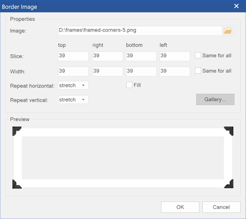
Slice
Specifies how to slice the images at each side. You can either enter a number (pixels) or percentages (eg. 33%).
Width
Specifies the width of each border side.
Fill
Causes the middle part of the image to be displayed.
Repeat
Specifies how to repeat the border image.
stretch - The image is stretched to fill the area.
repeat - The image is tiled (repeated) to fill the area.
round - The image is tiled (repeated) to fill the area. If it does not fill the area with a whole number of tiles, the image is rescaled so it fits.
space - The image is tiled (repeated) to fill the area. If it does not fill the area with a whole number of tiles, the extra space is distributed around the tiles.
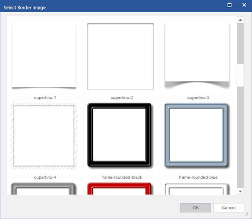
WYSIWYG Web Builder has many built-in styles which can be select via the 'Gallery' option.
Image
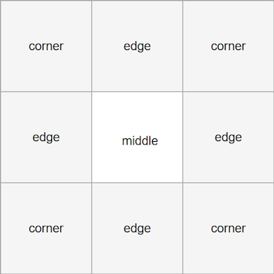
A border image is a single image that will be sliced into nine sections: four corners, four edges and the middle.
The "middle" part is treated as fully transparent, unless the fill property is set.
A border image is a single image that will be sliced into nine sections: four corners, four edges and the middle.
The "middle" part is treated as fully transparent, unless the fill property is set.
