The Ultimate Toolbox for creating
amazing web sites!
Section
Many users love Cards, because they are easy to create great looking content blocks. WWB18 has a new design element called 'Section'.
A section is a responsive, self-contained layout container. Sections works the same as Cards, but the main difference is that items can be freely positioned (layered). Self-contained means that all items in the section are embedded in the object itself, they are not separate elements (unlike layers and layout grids). This makes a section lightweight and adds lots of powerful options which normally would be difficult to implement with individually elements.
Sections can be useful for cases where you want to overlap multiple elements (for example images) which normally would not be possible in flexible layouts. The alignment (horizontal/vertical) of an element can be left, center, right, stretched or scaled. Just like a card, Sections support dividers, synchronized transitions, animations, events and much more!
Layout
A section supports the same items as Cards, with the exception of the header/footer item.
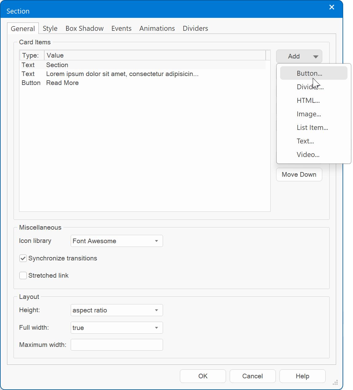
To add a new item, simply click the 'Add' button in the properties and select one of the items: button, text, divider, image, html or video.
For more information about each item please see the description in the Cards tutorial.
To add a new item, simply click the 'Add' button in the properties and select one of the items: button, text, divider, image, html or video.
For more information about each item please see the description in the Cards tutorial.
Add elements to a section
Related tutorials
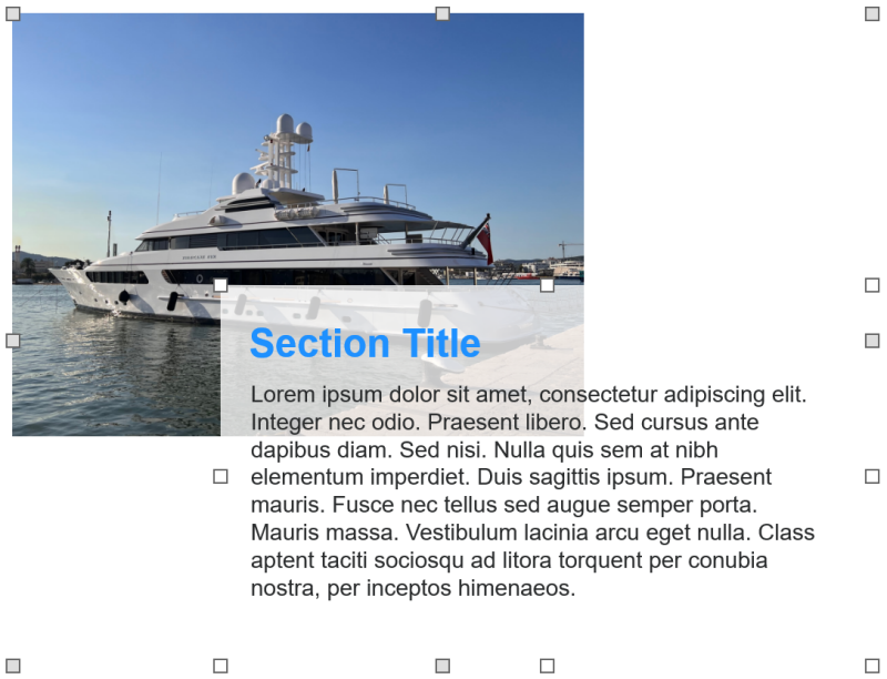
The Layout section in the properties can be used set to control the size and alignment of the items.
Note that you can also move and resize items via the mouse!
Note that you can also move and resize items via the mouse!
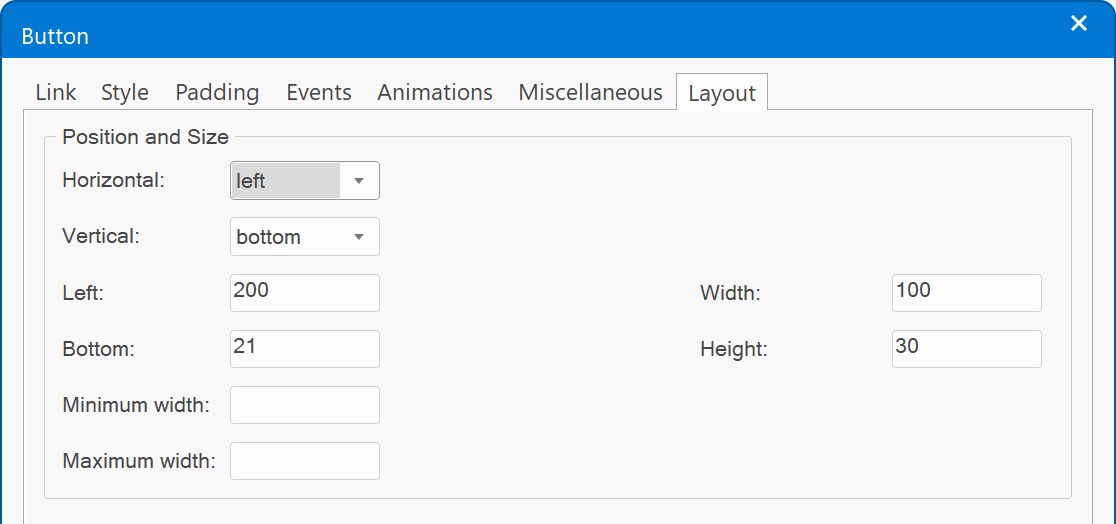
Horizontal
Specifies the horizontal alignment of the item relative to the section container: left, center, right or stretched/scale.
When centered, the item will always be in the horizontal center of the section. This means that you cannot move it horizontally with the mouse. When stretched, the item will automatically resize when the object becomes smaller or larger.
Scale will scale the item horizontally. Basically this means that the coordinates are in percentages.
Vertical
Specifies the vertical alignment of the item relative to the section container: top, middle, bottom or stretched/scale.
When centered, the item will always be in the vertical center of the section. This means that you cannot move it vertically with the mouse.
When stretched, the item will automatically resize when the object becomes smaller or larger.
Scale will scale the item vertically. Basically this means that the coordinates are in percentages
Left
Specifies the offset from the left side.
Specifies the offset from the left side.
Right
Specifies the offset from the right side.
Specifies the offset from the right side.
Top
Specifies the offset from the top side.
Specifies the offset from the top side.
Bottom
Specifies the offset from the bottom side.
Specifies the offset from the bottom side.
Width
Specifies the width of the item.
Specifies the width of the item.
Height
Specifies the height of the item.
Specifies the height of the item.
Minimum Width
Specifies the minimum width of the item. This can be useful in combination with the 'stretch' option, to make sure the item does not become too small.
Specifies the minimum width of the item. This can be useful in combination with the 'stretch' option, to make sure the item does not become too small.
Maximum Width
Specifies the maximum width of the item. This can be useful in combination with the 'stretch' option, to make sure the item does not become too wide.
Specifies the maximum width of the item. This can be useful in combination with the 'stretch' option, to make sure the item does not become too wide.
Examples
Here some layout examples with sections. All examples are scalable and responsive.
This example implements a (scalable) ‘cosmos’ with absolute positioned planets.
And … just for the fun of it, we’ve also added some mouse track effects to make the cosmos interactive😉
The planets move separately from each other.
And … just for the fun of it, we’ve also added some mouse track effects to make the cosmos interactive😉
The planets move separately from each other.
Demos
Lock Items
If this option is enabled, then items can no longer be selected in the workspace. This prevents them from being accidentally moved/resized.
If this option is enabled, then items can no longer be selected in the workspace. This prevents them from being accidentally moved/resized.
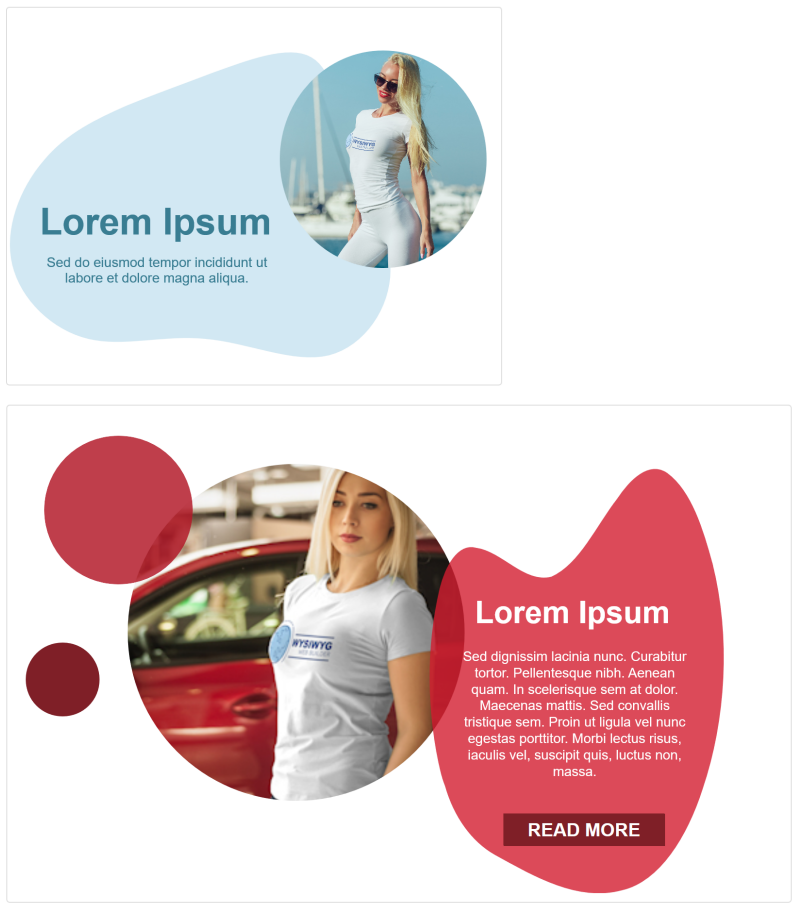
In additional to the items you know from Cards, Sections also support shapes.
Shapes are built-in SVG images that can be used to create unique backgrounds!
Shapes are built-in SVG images that can be used to create unique backgrounds!
Note:
Sections can also be used in a Card Container. However, it is important to note that the items in a Sections are absolute positioned.
So unlike Cards, the items in a Section do not affect the size of the Section itself. This means that if Sections are stacked in a Card Container (for mobile mode), that they do not have a defined height. But you can set the 'Minimum height' of the Section via the Flex Box properties to make sure it looks correct.
