The Ultimate Toolbox for creating
amazing web sites!
An introduction to the Layout Grid - Part 2
This is the second part of the layout grid tutorial. See also: An introduction to the Layout Grid - Part 1
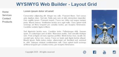
In this part we will implement a responsive layout by using the grid. This layout will have a header, footer and a content area with 3 columns.
Adding the header
Insert a layout grid. Set the column count to 1. Optionally set the background style.
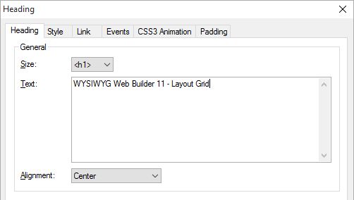
Add a Heading object and drag it inside the grid. To create some extra spacing around the heading, the margin has been set to 10.
Adding a footer
The Layout Grid of the footer will have 5 columns. One for the copyrights (and other info) and the other 4 to align social media icons.
The Layout Grid of the footer will have 5 columns. One for the copyrights (and other info) and the other 4 to align social media icons.
Adding content
Insert another layout grid. Note that the grid will automatically be postioned below the first grid. You can change the order of the grid with the Arrange Tools (Move Forward/Move Back).
Set the column count to 3.
Insert another layout grid. Note that the grid will automatically be postioned below the first grid. You can change the order of the grid with the Arrange Tools (Move Forward/Move Back).
Set the column count to 3.
If you test this layout in the browser you will notice that everything will scale nicely when you change the viewport size.
When the window becomes smaller than 480 (= breakpoints) then all columns will automatically stacked.
Note that each grid can have its own breakpoint!
When the window becomes smaller than 480 (= breakpoints) then all columns will automatically stacked.
Note that each grid can have its own breakpoint!


This grid will have a menu, text and image. Note that although we have only added one object in this demo, you can put multiple object inside a column!


You can view a live demo here:
http://www.wysiwygwebbuilder.com/support/layoutgrid
Download the demo project:
http://www.wysiwygwebbuilder.com/support/layoutgrid/layoutgrid.zip
http://www.wysiwygwebbuilder.com/support/layoutgrid
Download the demo project:
http://www.wysiwygwebbuilder.com/support/layoutgrid/layoutgrid.zip
Re-arrange layout grids and the objects inside the grid.
As you have noticed the positions of layout grids and objects are determined by the order you add them to the page. However you can later re-arrange them by using the Arrange tools. For example if you wish to move a layout grid up then you can use 'Move back' to change the order. The same can be done with the elements inside the grid.
As you have noticed the positions of layout grids and objects are determined by the order you add them to the page. However you can later re-arrange them by using the Arrange tools. For example if you wish to move a layout grid up then you can use 'Move back' to change the order. The same can be done with the elements inside the grid.

Layout Grid FAQ
Introduction to Responsive Web Design - The Basics
Responsive Web Design in WYSIWYG Web Builder
Create a responsive website with floating layers
Mobile Web Design in WYSIWYG Web Builder
Responsive Web Design FAQ (must read!)
How to use Master Frames with Layout Grids?
Introduction to Responsive Web Design - The Basics
Responsive Web Design in WYSIWYG Web Builder
Create a responsive website with floating layers
Mobile Web Design in WYSIWYG Web Builder
Responsive Web Design FAQ (must read!)
How to use Master Frames with Layout Grids?
Examples
Most templates in the Templates section of this website make use of Layout Grids. so there are hundreds of examples available!
https://www.wysiwygwebbuilder.com/templates.html
https://www.wysiwygwebbuilder.com/templates.html
Related Tutorials
Layout Grid Video Tutorials
Don't forget to explore these fantastic video tutorials on YouTube created by Web Builder Templates (crispy68):
https://www.youtube.com/@webbuildertemplates/videos
https://www.youtube.com/@webbuildertemplates/videos